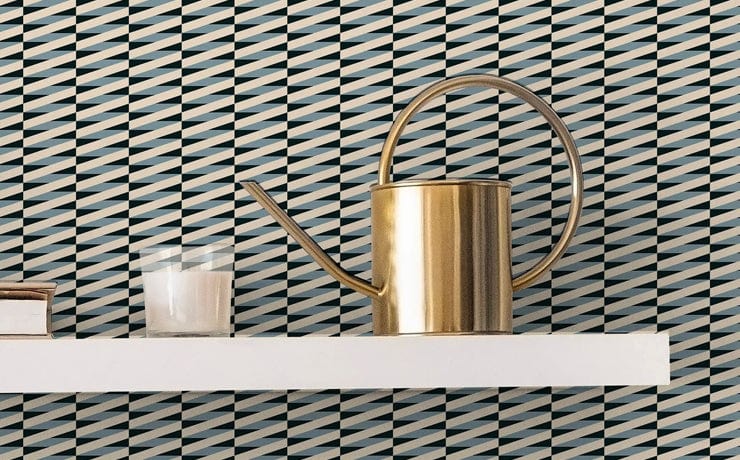
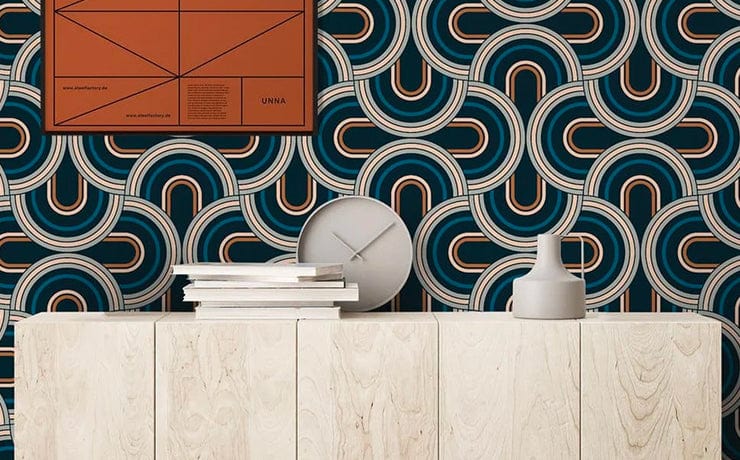
Paris — Print Stories
A print that runs on the same rails as a Cassandre poster — geometry as travel, colour as weather.
Walk out of the Gare du Nord on a grey Paris morning and the first thing you understand is geometry. Hittorff's 1865 facade rises in three deep arches, each one framed by paired pilasters and crowned by stone allegories of the cities the railway reached — Berlin, Vienna, Warsaw, Amsterdam, London. Behind that stone wall, a glass-and-iron train shed runs the length of two football pitches, the trusses repeating into the distance like a printed pattern stretched across the sky. The station was built to move people north. It also taught Paris how to draw.


The poster that printed the city.
In 1927 the Compagnie des Chemins de Fer du Nord — the company that owned Gare du Nord — commissioned a young designer named Adolphe Mouron, who signed his work Cassandre, to make a poster for its star service. He gave them Étoile du Nord: a single steel star floating above two parallel rails that taper to a horizon. Four colours. No people. No locomotive. Just geometry, distance, and the implication of speed.
The poster did to graphic design what Hittorff's facade had done to railway architecture sixty years earlier — it reduced the romance of travel to a structural drawing. Cassandre followed it the same year with Nord Express, in which the locomotive is built from cylinders and shafts of light, and in 1932 with Wagon-Bar, where the entire interwar dining car becomes a still life of bottle, glass, and bread on a vertical column. Pattern, in Paris in those years, did not decorate the city. It explained it.

Four colours, in proportion.
Paris works the same compositional logic. Four colours, held in tight rotation, build a repeating geometric figure that reads as architecture before it reads as decoration. The dominant tone is a deep peat brown — the colour of wet stone on a Haussmann boulevard at dusk. A moss stone grey-green sits beside it like the patinated copper of a mansard roof. Terracotta pink carries the chimney pots and the brick of the older arrondissements. Warm linen holds the limestone facades in low afternoon light.
The proportions matter. None of the four colours overwhelms the others, but each holds a quarter of the field with measurable difference — the way Cassandre balanced a single red against three earth tones in Étoile du Nord. The eye does the addition without being asked. The pattern reads as a structure rather than a surface.

Pattern, in Paris in those years, did not decorate the city. It explained it.
Cassandre worked in Montparnasse alongside two artists who held the same conviction about geometry. Fernand Léger — back from the trenches and unable to paint anything that did not feel mechanical — was building canvases out of cylinders, pistons and curved planes, the human figure assembled from the same parts as a locomotive. A short walk away, Sonia Delaunay was running her Boutique Simultanée, the 1925 pavilion at the Exposition des Arts Décoratifs where she sold geometric coats, scarves and book bindings, treating colour and shape as a single design problem regardless of medium. The three of them were working the same room: pattern as a serious idea, distributed across posters, paintings and printed cloth.
The Paris print sits in that lineage. Paris belongs to the Modernist III collection — and the name reaches all the way back to that interwar moment when the city decided that a clean geometric figure, four colours, and a balanced grid could carry as much meaning as any ornament. Hang a wall in Paris and you are hanging a poster the size of a room.
Palette — Paris
- Peat#523934
- Moss Stone#6E7166
- Terracotta Pink#CE6D6C
- Warm Linen#E7CCB8


◼
The Jupiter 10 studio · London · 2026