Pattern, Renewed — Trends
Three ways contemporary wallpaper is moving past minimalism.
For a decade, interiors went quiet. White walls, scaled-back detail, the aesthetic of restraint. It was a useful correction to the maximalism that preceded it — but it ran out of ideas. The rooms being commissioned in 2026 look different. Not louder. More considered. Wallpaper, an art that had been quietly replaced by paint in the minimalist years, is back — and it is arriving through three distinct strands. Each is being picked up by a different audience. Each sits in a different part of our catalogue. Each one is a way of saying the same thing: that a surface is a decision, not a default.
Flowers, handled as paintings.
The first thing to come back was flowers — but painted, not drawn from nature. Ava runs bold poppies in warm red against a ground that reads more like a wet canvas than a pattern repeat. Beatrix layers irises across lilac, aubergine and soft violet with the same energy. Camille lets fiery red and vivid green collide at a scale that wouldn't have been specified ten years ago.
The Bloom collection is where most of this lives. It has been picked up heavily by interior designers working on boutique hotel groups briefed to do something "less corporate" in guest rooms — a brief that turns out to mean painterly wallpaper almost every time.

What is useful about painterly work is what it is not: not chintz, not cottage, not a heritage revival. It is floral handled as abstract painting. Read closely, many of the designs don't even resolve into recognisable flowers. The plant is the starting point, not the subject. It is also the strand most comfortable to live with. Once in a room, painterly work reads differently at morning, midday and evening light — the pattern moves with the day. Designers who have installed Bloom report it is the one that lands best with nervous clients. It behaves.
Palette — Ava
- Warm Linen#E7CCB8
- Sandstone#DAB990
- Olive Grey#A09983
- Poppy Red#E04723
- Moss Stone#6E7166
- Terracotta Pink#CE6D6C
Print that couldn't exist before the screen.
The second strand could not have existed twenty years ago. Glitch takes distortion, pixel break, and the visual artefacts of digital image-making and treats them as legitimate print language. Gamma works deep reds, maroon and coral into a colour bleed that looks closer to a screenshot of a rendering error than to a traditional print. Bors sets pixel fragments against blue-black with the density of a circuit diagram.
It sits closest to contemporary art. It reads as picture before it reads as pattern, which is why it is being specified by creative studios, boutique record labels and independent hotels that want their interior to signal something newer than Scandi restraint.

A wall in Gamma behaves less like a backdrop and more like a hung painting — which is the effect Glitch is designed to produce. It is also, technically, the most difficult of the three to execute well. A small distortion on a screen is interesting; the same distortion on a thirty-square-metre wall can tip from artefact into chaos. The designs that work are the ones where the "error" is controlled — specific, repeating, legible at scale.
Palette — Gamma
- Oxblood#8C3534
- Ink#172021
- Bordeaux#581E23
- Warm Graphite#57514C
- Taupe Stone#7A7671
A surface is a decision, not a default.
Pattern that assumes the room will be lived in.
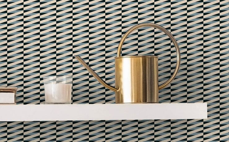
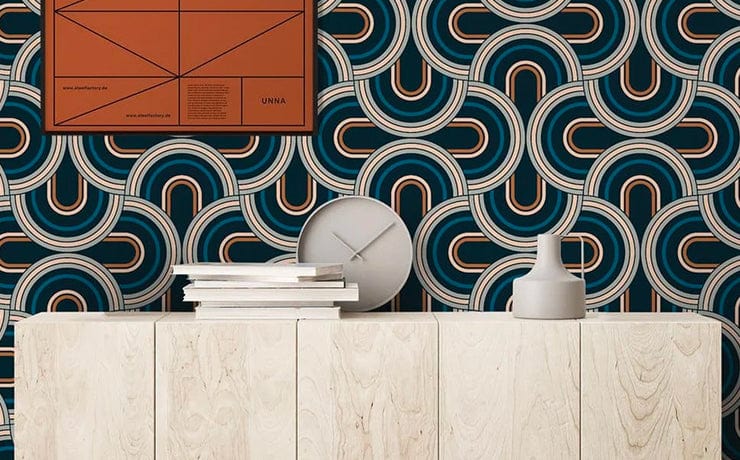
The third is the one people least expect to call contemporary: geometry. But the work in Londoner is not the broad, loud geometry of a decade ago. It is quieter — a fine black trellis holding blush and taupe in Soho II, caramel and espresso laid on duck-egg blue in Farringdon I, circles running through pink and plum in Bloomsbury II.
Each design is named after a London neighbourhood and carries a certain neighbourhood-scale intimacy. These are patterns drawn to be lived with, not declaimed at.

Palette — Soho II
- Blushed Petal#F3C1BD
- Soft Taupe#B2A998
- Mineral#8E8179
- Peat#523934
The architectural strand is the most widely specified of the three this year. It works in dining rooms, hallways, bedrooms, hospitality corridors — anywhere that needs a surface to do real work without becoming the room's main story. Designers working on private residences lean on it for the same reason: a Londoner pattern gives a room character without forcing a commitment.
If painterly reads as gesture and abstract reads as argument, architectural reads as architecture — a surface that assumes the room will be lived in, and leaves space for it. Between the three there is a quiet consensus. Pattern is not an excess. It is not a revival. It is, again, a serious way of treating a wall — and the rooms being designed this year are the first in a long time to treat it as such.
◼
The Jupiter 10 studio · London · 2026